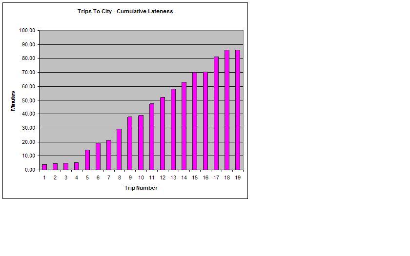
The first graph shows the number of minutes that the train arrived late at Flinders Street for each Sandringham to City service that I caught. The second graph shows the cumulative lateness for these trips.
Some people find it much easier to look at data in the form of a graph or a chart, so I hope that this help you to see just how poor Metro's rush-hour service really is. I find the second chart quite powerful - it shows just how much time Metro's late running is costing me. Over the 19 trips to the city, Metro has wasted 86 minutes of my time (i.e. if the services had been punctual, I'd have had 86 minutes to do something else). Not only that - for those 86 'lost' minutes I was either waiting on a platform, or (worse) stuck on an overcrowded train.
Until my next update, good luck with your commuting. You'll need it.

No comments:
Post a Comment